Transforming Counselor Insight into Personalized Financial Aid Tools

Transforming Counselor Insight into Personalized Financial Aid Tools

Transforming Counselor Insight into Personalized Financial Aid Tools

year

2023-2025

Role

Design Lead: User Experience/ User Interface/ Service Design

timeframe

2.5 years

tools

Figma, Simple Html, CSS, Wordpress, Notion, Adobe

Team

Kim Nauer, Laura Zingmond, Shristi Singh, Frida Moreno, RJ Matson, Patrick Moroney, Geoff Decker, Myles Ashitey, Gil Hatcher, Carrie Kuo, Hannah Lee

Leads the tool development and web strategy of UnderstandingFAFSA.org, a national digital financial aid access platform housed within the Center for New York City Affairs at The New School and affiliated with the City University of New York. The platform translates complex federal financial aid regulations into accessible, actionable digital infrastructure for students, families, school counselors, and financial service professionals across the United States, including vulnerable populations such as homeless students seeking to complete their degrees and first generation American students pursuing access to higher education.

Since assuming leadership in 2022, and through the strategy and interactive tools she designs, codes, and develops, the platform has achieved the following measurable outcomes:

• Annual users increased from 18,225 in 2022 to 190,462 in 2025, representing 945 percent growth in three years
• Reached 208,972 users by February 2026, surpassing the entire 2025 total in under two months
• Sessions increased from 25,534 in 2022 to 238,965 in 2025, nearly a tenfold expansion

?

How might we?

How might we design a digital experience that demystifies FAFSA for first-generation students by translating federal policy into tools that support real-time decision-making, financial clarity, and institutional trust?

Intervention

We redesigned UnderstandingFAFSA.org into a student-centered platform focused on usability, clarity, and trust. The intervention included an interactive bill estimator, a map of local grant and FAFSA resources, and comparison tools that present aid options in accessible ways. We restructured the system for mobile access and multilingual use. Through participatory workshops and iterative prototyping with students and counselors, we aligned the experience with real user behavior. Platform usage grew from 2,000 to over 30,000 monthly users, and it has since been adopted by schools and nonprofits across the country.

?

We audited the original site to identify navigation barriers, then redesigned the information architecture to simplify pathways and improve accessibility for younger users. The new structure follows ADA compliance and introduces a step-by-step, student-friendly flow that supports independent exploration of financial aid resources.

Scroll through the page to explore personalized resources, intuitive visuals, and easy-to-use features designed to make the FAFSA process clearer and more approachable.

Testing in Real Time, with Real Students As part of our iterative design process, we invited students to engage with the Understanding FAFSA platform and its supporting materials, including translated PowerPoint decks, guides, and policy explainers. Using a participatory approach, we gathered feedback on language clarity, usability, and decision-making flow. Through playtesting sessions, students interacted with live versions of the site and shared what felt confusing, helpful, or empowering.

Testing in Real Time, with Real Students As part of our iterative design process, we invited students to engage with the Understanding FAFSA platform and its supporting materials, including translated PowerPoint decks, guides, and policy explainers. Using a participatory approach, we gathered feedback on language clarity, usability, and decision-making flow. Through playtesting sessions, students interacted with live versions of the site and shared what felt confusing, helpful, or empowering.

We’re running Design Thinking workshops with CUNY advisors to co-create clearer, more human FAFSA guidance for students and families on UnderstandingFAFSA.org. Through quick, hands-on activities (mapping pain points, rewriting confusing steps, and prototyping messages), we turn real advising experience into practical, fill-in-the-blank templates and page improvements. The result is faster, less stressful support that reflects what students actually ask, and what advisors need to respond with confidence.

We’re running Design Thinking workshops with CUNY advisors to co-create clearer, more human FAFSA guidance for students and families on UnderstandingFAFSA.org. Through quick, hands-on activities (mapping pain points, rewriting confusing steps, and prototyping messages), we turn real advising experience into practical, fill-in-the-blank templates and page improvements. The result is faster, less stressful support that reflects what students actually ask, and what advisors need to respond with confidence.

UI/UX system with accessible color palettes, clear type hierarchy, and modular components designed for clarity and ease of use. Through continuous playtesting with first-generation students, we identified and resolved key usability pain points; reducing navigation errors by 40% and increasing task completion across mobile devices.

The State Funding Map is a dynamic, user-tested tool that helps students explore local FAFSA and grant deadlines by state. Designed through systems mapping it streamlines access to fragmented policy information. Since launch, the tool has supported thousands of users in identifying on-time aid opportunities, reducing missed deadlines and increasing application completion rates.

The Bill Comparison Tool is an ongoing research-driven feature that helps students navigate real college cost scenarios through side-by-side comparisons. Co-developed with first-generation students, it simplifies financial data and continues to generate insights that inform content clarity and decision-making support.

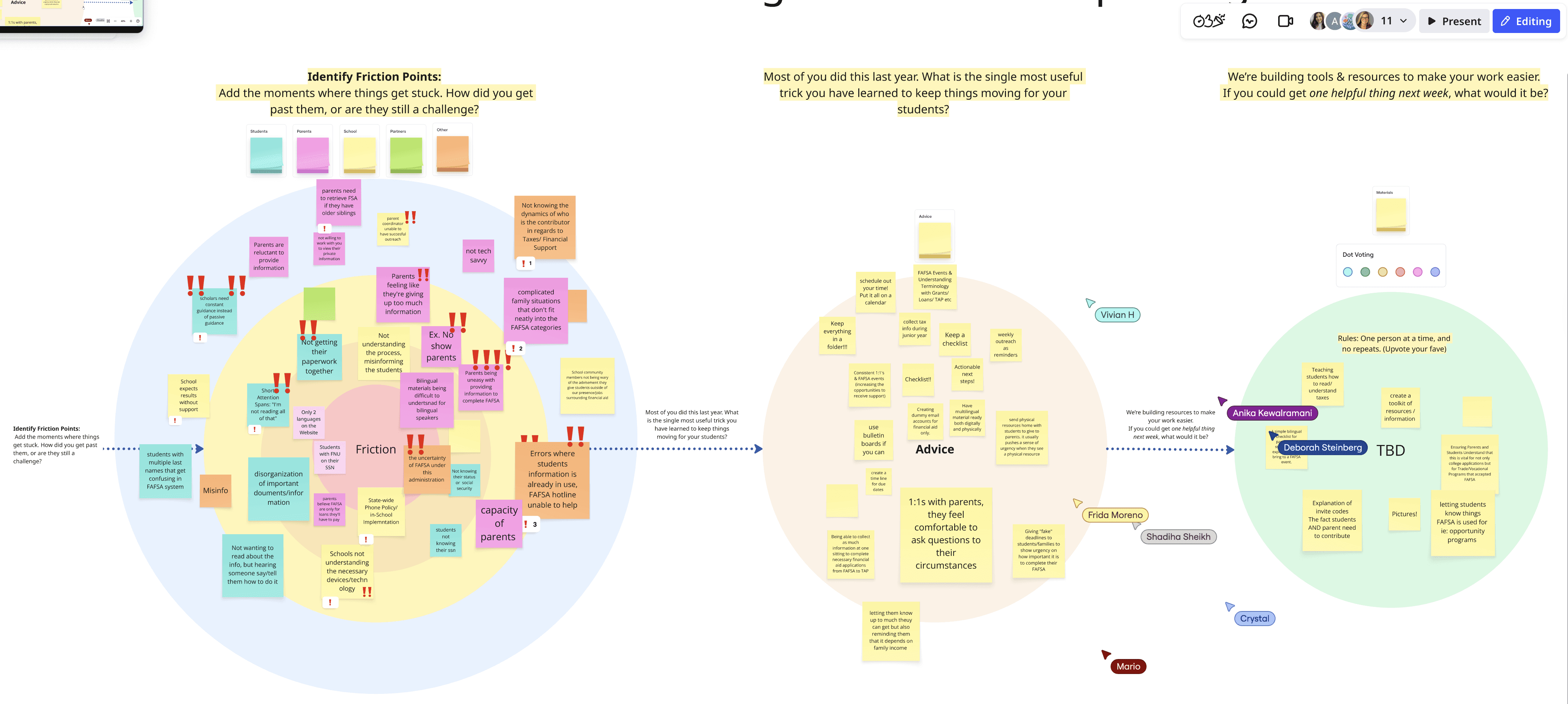
We also run rapid co-design sprints with advisors in Miro, and this is how we personalize the site: we capture real advising friction, patterns, and language, then translate it into structured insights that continuously improve UnderstandingFAFSA.org. By blending service design with UX, we turn lived experience into clearer flows and clean UI that students can move through with confidence.